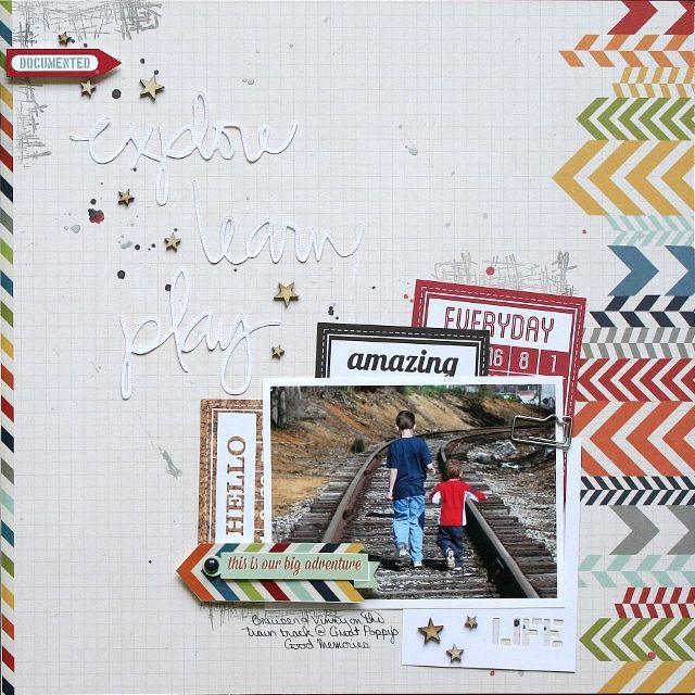
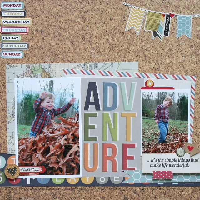
Here is the layout I made for this challenge...
1. White doesn't have to mean the actual color white! If you notice on my adventure layout, I used the cork patterned paper, but I left a lot of the cork showing.
2. I like to balance the design on both sides of my paper (or top/bottom) - for instance the paper I chose had the chevrons down the one side of the paper and so I added a strip of paper to the opposite side to keep my design balanced.
3. Use ink/mist/stickers/wood veneers/etc... to fill in some of that white space, but without really adding anything too heavy. I also added the die cut words in white to fill my space - not adding anything to heavy, but something that would catch the eyes.
4. Think diagonally, vertically, or horizontally but fill that area. In this layout I was thinking diagonally and I filled the diagonal completely.
5. And layer - once I had the basic design of my page I then added some stamps in that diagonal area, I layered a few of the Bingo cards, the paper clip and the sticker/brad were also added.
So your challenge is to create using white space, even if that isn't your thing, shake your thing up a little and see what you can do! Hope you come and join us over at Memorable Seasons - our Throwdown competition starts this Thursday!


No comments:
Post a Comment